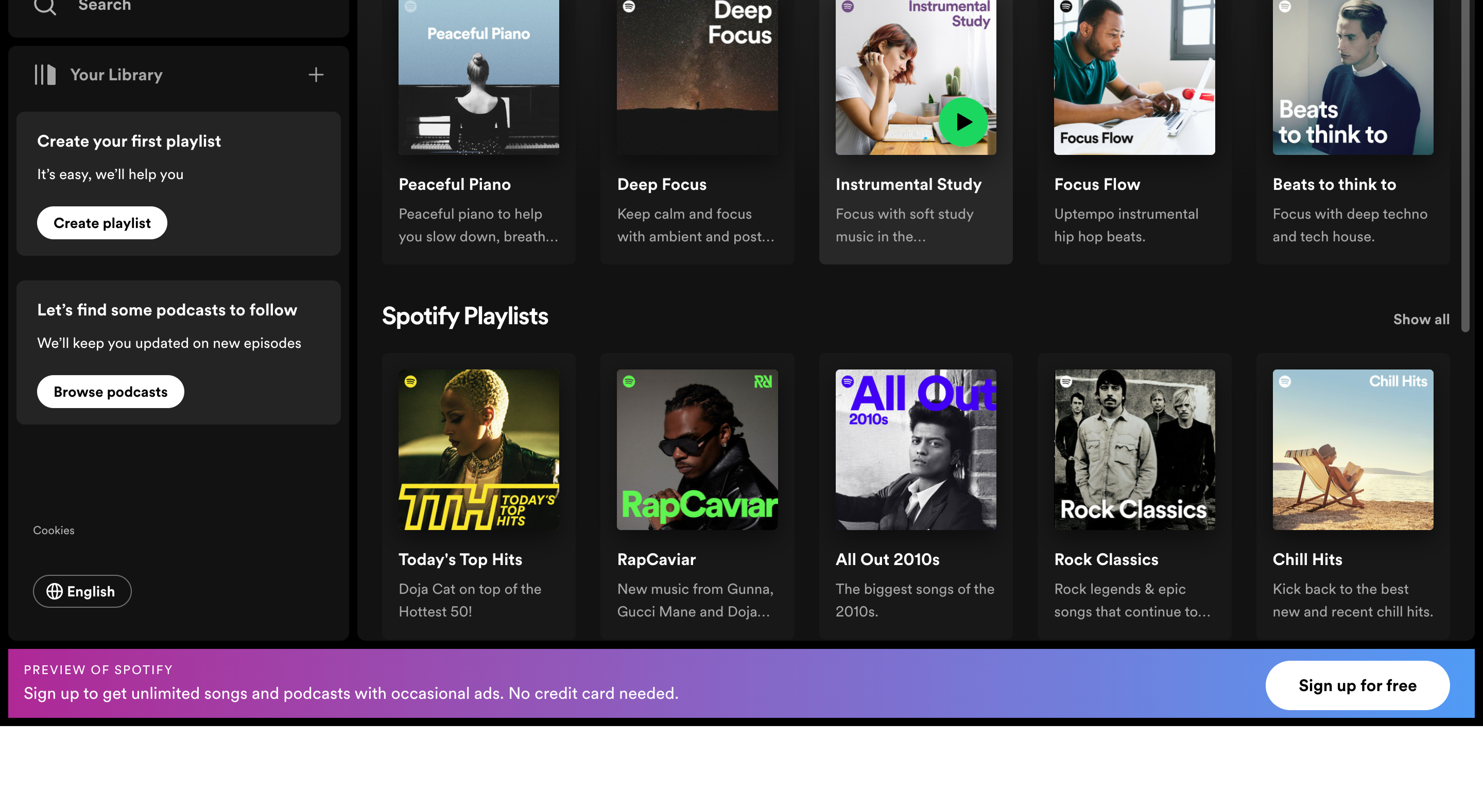
Spotify has announced a significant revamp to its Desktop user interface, with redesigned “Your Library” and “Now Playing” views, aiming to enhance the way users explore, curate, listen to, and organize music on a computer or web browser. The main content area remains unchanged, serving as the central hub for browsing, discovering, and finding recommended songs and podcasts.
The new “Your Library” is now anchored on the left-hand side of the app window, allowing users to swiftly access their saved music and podcast collections. Initial feedback suggests that the new Library offers a better overview, saves time, and simplifies the switching between playlists.
On the right-hand side, the “Now Playing” view displays the current song or podcast that’s being listened to. This section provides more information about the song and artist, including tour dates and merchandising details. For select podcasts, users can follow along with transcripts.
The redesigned features are meant to provide a richer experience, more context, and quicker access to personal favorites. The “Friend Activity” feed is still available and can be accessed via the “Friends” icon next to the user’s profile picture.
Users can take full advantage of the redesigned features with a number of tips provided by Spotify. These include a compact view of the Library, exclusive searching within the Library, customizable sizes for the Library and Now Playing views, and the ability to pin and move playlists in the Library. Users can also drop songs into editable listed playlists.
The new “Your Library” and “Now Playing” views have started rolling out to all Desktop users worldwide from June 20, 2023. Users can test the new features by launching a flagship playlist like “Today’s Top Hits” on their Desktop or on their web browser.


