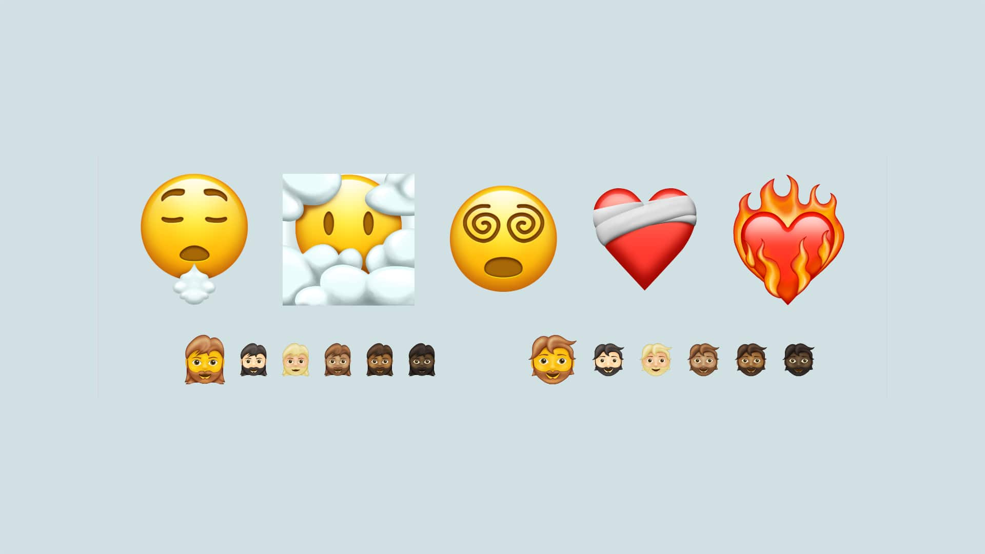
With Android 12, Google is redesigning the emojis. Instead of sticking to a flat, minimalist design, the pictograms are given more life and depth. In the case of an emoji category, the visual innovation is particularly noticeable.
For many smartphone users, emojis have become indispensable. They add liveliness to a text that without a tone of voice and facial expressions would otherwise often appear brittle and boring. In Android 12, Google once again touched the emojis and changed their appearance slightly.
Emojis in Android 12 come to life
A common thread running through the emojis in Android 12 is the extensive departure from flat designs. The emojis look livelier and, thanks to reflections and shadows, have more depth. This careful redesign can be seen particularly clearly in the food sector, above all fruit and vegetables.
However, Google does not seem to be entirely conclusive with the new design line. The style of the “new” strawberry, for example, looks like the “old” mango and vice versa. Since this is the first beta of Android 12 so far, it is to be hoped that a uniform optical line will be found by the final release in late summer. Emoji graph has compiled a complete list of over 389 altered emojis that the latest version of Android brings with it.
The last major emoji update came in 2017
The last major update for Android emojis was in Android O from 2017. At that time, Google had said goodbye to the so-called “blob design”, which is reminiscent of worms and gummy candies. Instead, the group based itself on the design that Apple also uses in iOS, macOS. In comparison, the change in Android 12 looks downright conservative. It also remains to be seen whether and to what extent all manufacturers of Android smartphones will switch to the new Google design. As has always been the market leader uses Samsung as its very own emoji.


